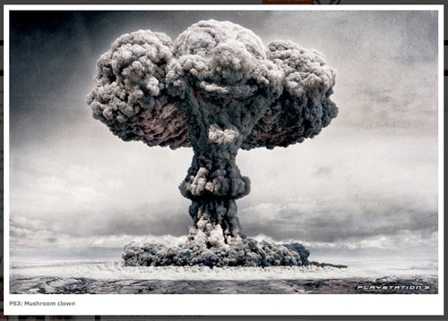
This PS3 ad won for July 2007 at AdofDaMonth
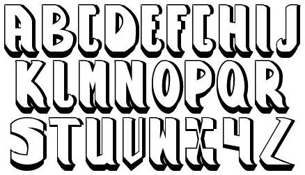
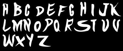
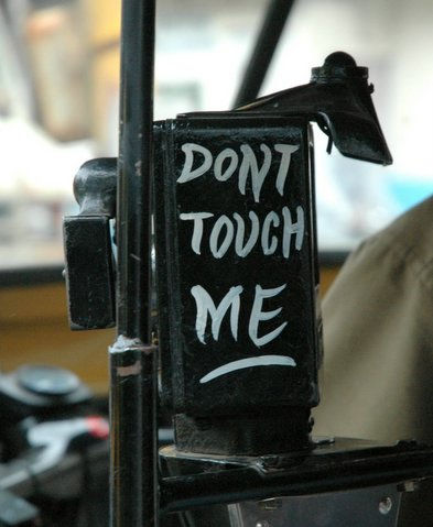
This friday’s font, DontTouch is inspired from a Mumbai Autorickshaw Meter warning. Created by Nabina Ghosh.
here’s the inspiration:

Anuj and Denesh are a unique creative team based in London, however with worldwide domination in mind. For the past 5 years they have worked at various respectable above and through the line agencies, “as we are boffins in everykind of communiqué. We’re always ready and waiting for the next challenge. Some of our favourite work has never been made because it’s in our conceptportfolio, that’s the way we like it.” (more…)
Sourabh has posted the Logo Quiz. Lets see if we can identify the logos. There are some 200 pages of logos and I was quite humbled by how few logos I can identify correctly. Check it here
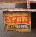
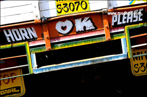
HornPlease is this Friday’s Font. Created by DesiCreative member Nabina Ghosh, inspired by the hand paintings behind trucks in India.
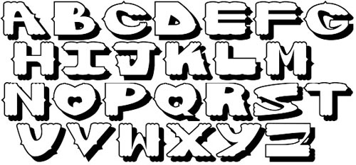
The inspiration:
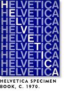
Hard core designers know the controvery of Arial vs Helvetica. For those who dont, I found this wonderful article at Mark Simpson’s blog. Read the full article here.

“When Microsoft made TrueType the standard font format for Windows 3.1, they opted to go with Arial rather than Helvetica, probably because it was cheaper and they knew most people wouldn’t know (or even care about) the difference. Apple also standardized on TrueType at the same time, but went with Helvetica, not Arial, and paid Linotype’s license fee. Of course, Windows 3.1 was a big hit. Thus, Arial is now everywhere, a side effect of Windows’ success, born out of the desire to avoid paying license fees.
Despite its pervasiveness, a professional designer would rarely—at least for the moment—specify Arial. To professional designers, Arial is looked down on as a not-very-faithful imitation of a typeface that is no longer fashionable. It has what you might call a “low-end stigma.” The few cases that I have heard of where a designer has intentionally used Arial were because the client insisted on it. Why? The client wanted to be able to produce materials in-house that matched their corporate look and they already had Arial, because it’s included with Windows. True to its heritage, Arial gets chosen because it’s cheap, not because it’s a great typeface.”
Scott Adams, creator of Dilbert, reflects on his own career (which includes majoring in economics, picking up an MBA, and working at a bank and a phone company before becoming a world-renowned cartoonist) and gives his thoughts on what it takes to develop a successful career.
If you want an average successful life, it doesn’t take much planning. Just stay out of trouble, go to school, and apply for jobs you might like. But if you want something extraordinary, you have two paths:
1. Become the best at one specific thing.
2. Become very good (top 25%) at two or more things.The first strategy is difficult to the point of near impossibility. Few people will ever play in the NBA or make a platinum album. I don’t recommend anyone even try.
The second strategy is fairly easy…
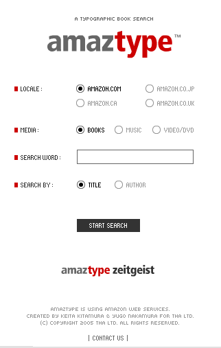
Amaztype. This is the most amazing thing I have seen on the internet in the last few months! I wont disclose anything, just visit the site. Thanks to desicreative community member manojb11in who pointed this out.