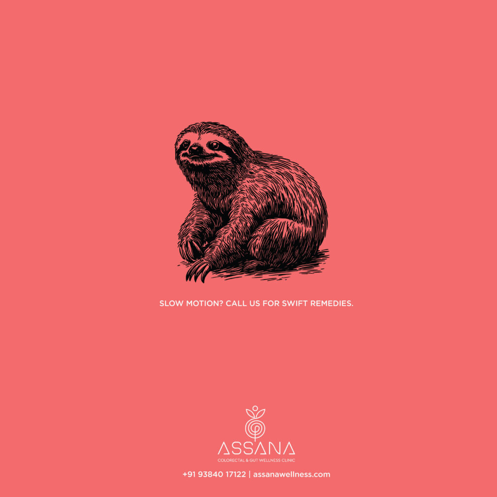
Advertising Agency: bepositive24 Innovation Design Ltd.
Art Director: Balakumar
Copywriter: Nina David
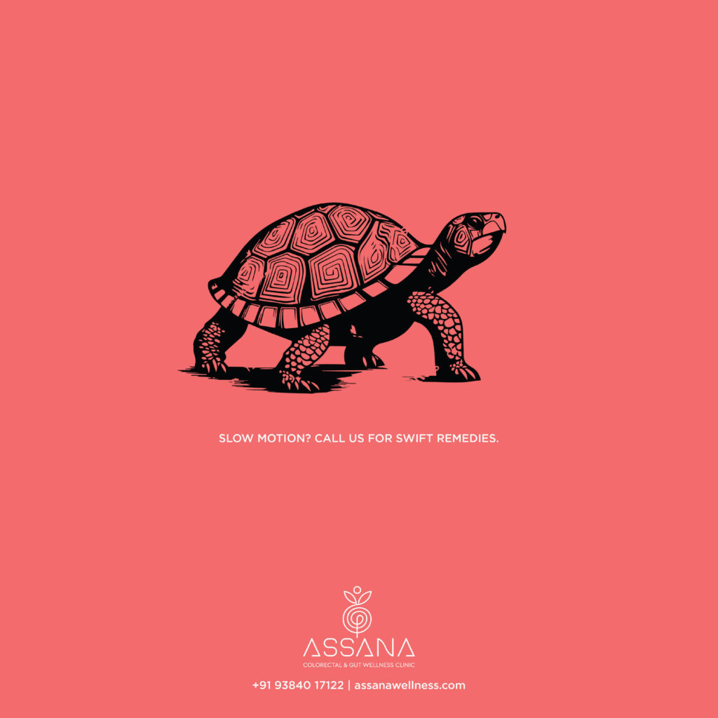


Advertising Agency: bepositive24 Innovation Design Ltd.
Art Director: Balakumar
Copywriter: Nina David
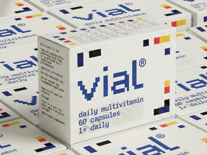
vial is a multivitamin packaging and identity project designed by Presentable, an independent design studio based in Gurugram, India. It reimagines supplement packaging as a designed system that prioritises consistency over intervention. Rather than positioning supplements as corrective or clinical, the project frames daily nutrition as an integrated ritual: accessible, structured, and enduring.
Supplement packaging often leans on urgency, clinical signals, or aspirational lifestyle cues, frequently resulting in visual clutter and exaggerated promises.
Conventional products rely on pharmaceutical visual codes — clinical typography, saturated colour palettes, bold efficacy claims, and urgency-driven messaging — to signal potency and justify purchase. While effective at communicating authority, these cues frame supplements as corrective interventions, encouraging episodic use tied to perceived deficiency rather than sustained daily practice. The visual language positions the product as a response to something wrong, reinforcing a reactive model of health in which consumption begins and ends with the problem.
That approach was built for a moment that matters less each year. Packaging was always designed for the three seconds of the shelf grab, and for that moment, louder worked. But health and beauty are now lived with rather than glanced at, seen daily at the bathroom counter and the bedside shelf, and consumed as ritual on Instagram: morning routines, shelfies, restocks. A pack that shouts can win a second at the store shelf; on a counter, it feels out of place. Quiet is what people can live with, and be seen living with.
(more…)
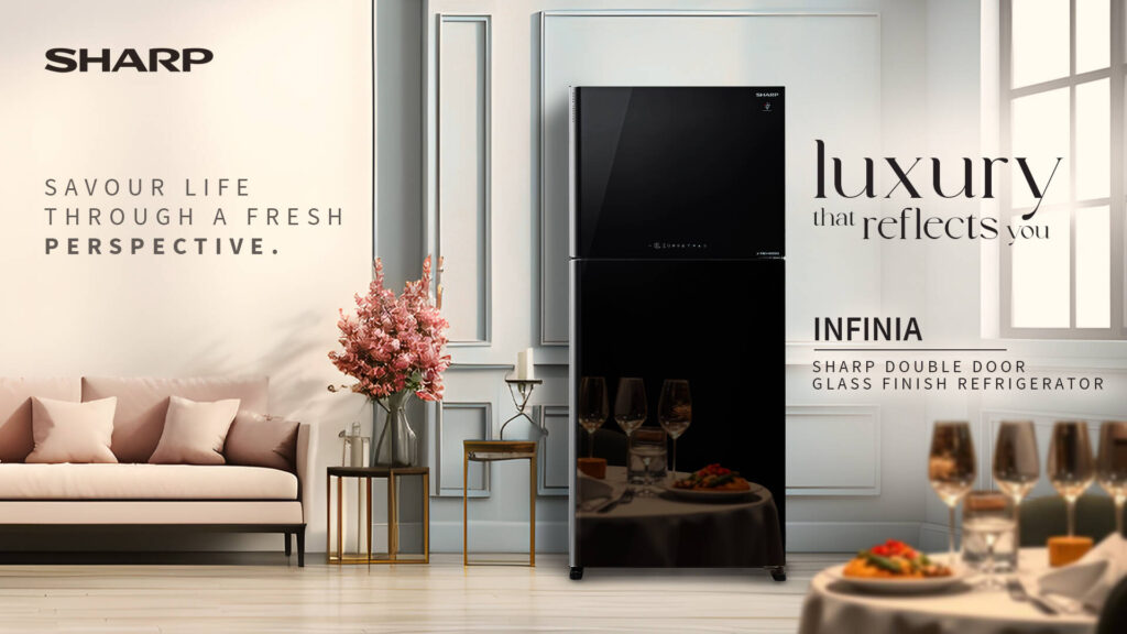
Advertising Agency: Horizon9, Noida, India
Lead Designer: Manas Swain
Senior Designer: Sharat Mohan
Copywriter: Piyush Diwakar, Abhishek Sajwan
Account Management: Pranjal Misra
Business Director: Abhishek Ghavri
Creative Director: Kshitij Narain

Advertising Agency: Horizon9, Noida, India
Lead Designer: Manas Swain
Senior Designer: Sharat Mohan
Copywriter: Piyush Diwakar, Abhishek Sajwan
Account Management: Pranjal Misra
Business Director: Abhishek Ghavri
Creative Director: Kshitij Narain
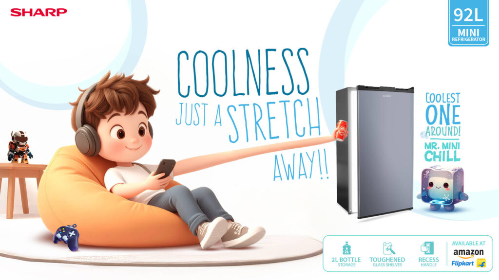
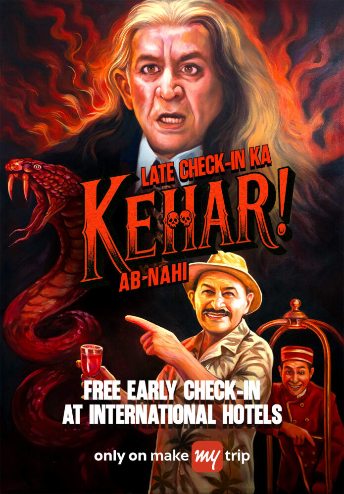
Team Restless @Magiccircle
Chief Creative Officer: Dheeraj Renganath
Chief Operating Officer: Ashit Chakravarty
Executive Creative Director: Shray Chawla
Executive Creative Director: Akshit VS
Executive Strategy Director: Angira Lahiri
Creative Director – Copy: Rishabh Kapoor
Account Director: Kathakali Chatterjee
Associate Creative Director – Art: Samiksha Singh
Associate Creative Director – Copy: Naman Khajanchi
Senior Account Manager: Siddhant Dutta
Art Supervisors: DESHNA GADA
Art Director: Hemant Yadav
Team MakeMyTrip: Raj Rishi Singh, Abhinav Narula, Harsh Agarwal, Palash Arora, Suhani Verma
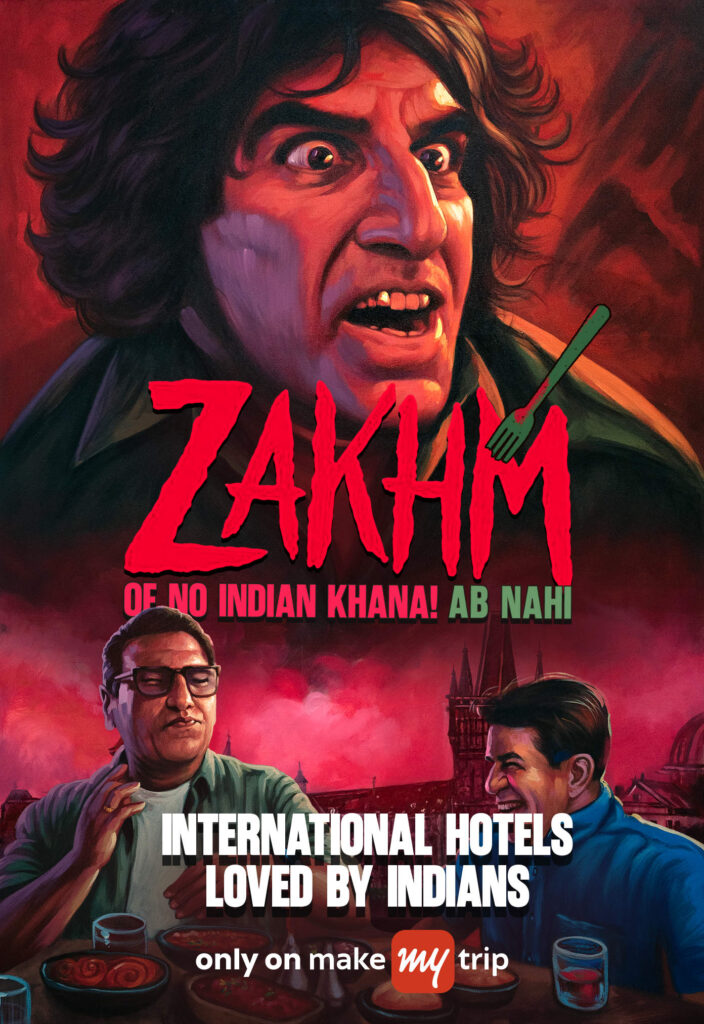

Advertising Agency (School): Post Office Media
Art Director: Vipul Arora
Copywriter: VipulArora


Advertising Agency: Sociowash
Production Company: Sociowash, New Delhi
Designer: Deepak Kumar
ACD: Gaurav Gupta
Copywriter: Madhur Budhiraja

Advertising Agency: Freeflow Ideas, Bengaluru, India
Head of Creative: Dayanand
Creative Director: Chaitanya Kiran
Copywriter: Chaitanya Kiran
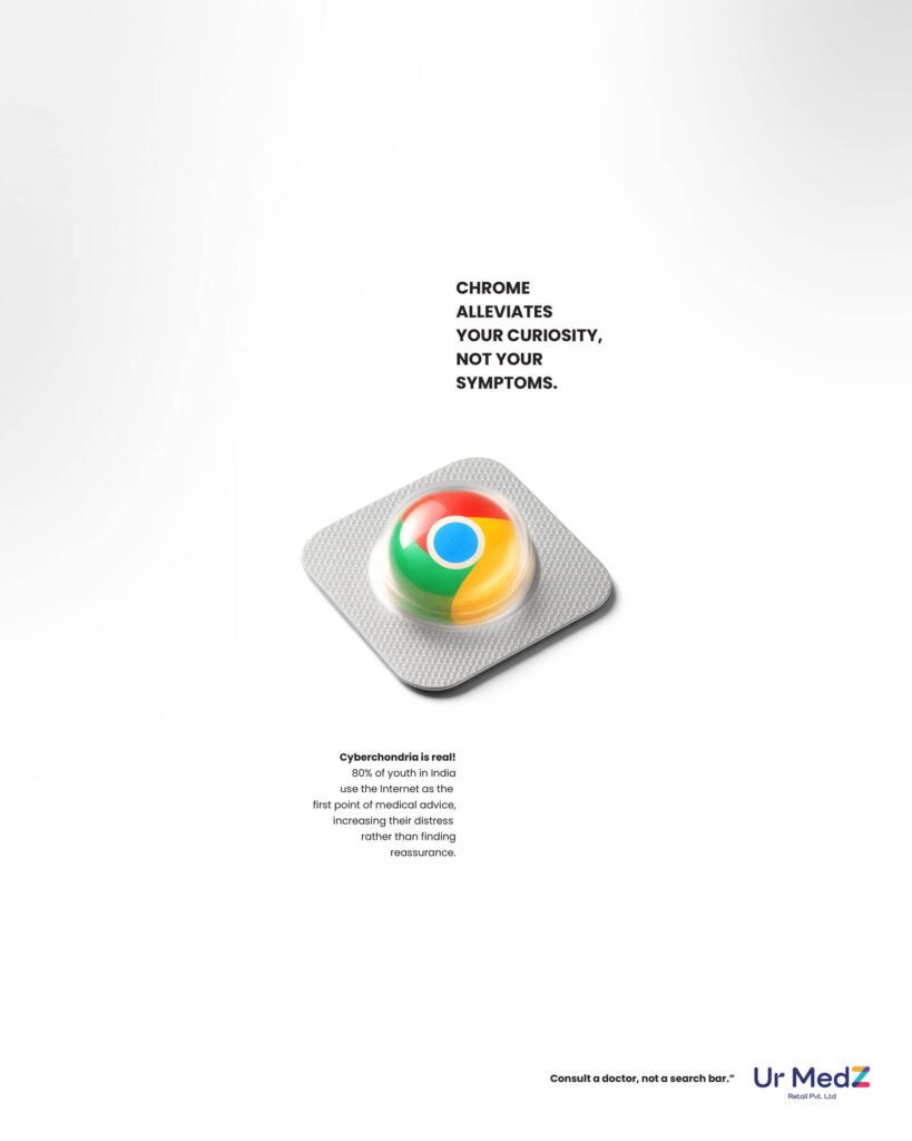

Advertising Agency : Join The Dots
Partners: Argha Das, Sayan Chandra, Nishant Sarkar
Executive Creative Director: Sayan Chandra, Argha Das
Senior Visualizer & Art: Tanmoy Mistry
Creative Consultant: Altamash Hamid

Advertising Agency (School): Post Office Media
Art Director: Vipul Arora
Copywriter: Vipul Arora