Page 1 of 3
Do you Like Airtel's New Logo?
Posted: Fri Nov 19, 2010 12:33 am
by Ek Kanya
Airtel changed its logo as it went from Rediff to JWT. Do you like the new logo?
I, for myself, like the font. But HATE the graphic yuck that comes with it. The font by itself is meek. The 'A' should have been uppercase too.
Here's their new signature tune. I dont have much to say for it. Its not interesting for me either. Its not contemporary, but so typical Rehman.
[youtube]IwcUER0fIrQ[/youtube]
And whats with this firangi film with a Hindi VO? Isnt Airtel an Indian brand? Arent they proud of their Indian identity?
[youtube]_BR0JB3z6gI[/youtube]
Dont Indian boys and girls deserve a place in an Airtel Ad? What do you think?
Re: Do you Like Airtel's New Logo?
Posted: Fri Nov 19, 2010 1:09 am
by Saumya
sucks. the TVC, I mean.
Re: Do you Like Airtel's New Logo?
Posted: Fri Nov 19, 2010 11:18 pm
by santoshsharma
NO. When I saw it first ..i said to myself "What was that?" Seems to me a logo for some children product or brand. Poor.
Re: Do you Like Airtel's New Logo?
Posted: Sat Nov 20, 2010 10:37 am
by csahab
मेरे ख्याल से a के साथ खेला गया है क्योकि Airtel पहले A था अब small हो गया है और साथ में Zain का अधिग्रहण इनके लोगो में साफ साफ है.
और जैसा लोगो हो मेरे ख्याल से उससे बुरा कुछ भी नहीं है
मुझे भी लोगो पसंद नहीं आया
Re: Do you Like Airtel's New Logo?
Posted: Sat Nov 20, 2010 1:53 pm
by tarun212k4
I liked the ad but the logo is very bad... I find it kiddish, The earlier logo was much better. Even the font is also not good. But the ad is nice. I liked the concept,and the way its been executed
Re: Do you Like Airtel's New Logo?
Posted: Sun Nov 21, 2010 11:19 am
by antzfx
Airtel has acquired Zain Africa's operations in 15 countries. The following is Zain's logo.
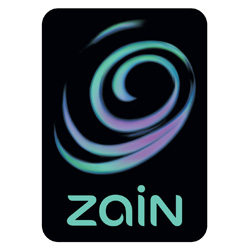
Zain may have influenced airtel's new logo. For me, Zain logo is an 'eye of a storm.' I have seen the new airtel logo animated as a tornado in a couple of websites. The following screenshot is from Times Of India website (19-Nov-2010).

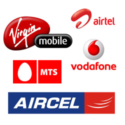
Red seems to be the favorite color in Indian Telecom sector. Vodafone, Virgin Mobile, MTS (Sistema Shyam TeleServices Limited), Aircel and now airtel all are using this color.
Here is the full post on Airtel logo:
http://kikkidu.com/airtel
Re: Do you Like Airtel's New Logo?
Posted: Sun Nov 21, 2010 8:20 pm
by Allen Mathews
good point with the Zain connect, Antzfx. But I think the 'airtel' lettering is a bit lame and under-represented.
Re: Do you Like Airtel's New Logo?
Posted: Sun Nov 21, 2010 8:37 pm
by Saumya
the new Airtel lohgo has a rather weak typeface. Even a simple 'Arial Rounded' looks better.
Re: Do you Like Airtel's New Logo?
Posted: Mon Nov 22, 2010 9:13 am
by vikas
i tend to agree with the general thoughts here. The new logotype is quiet weak and the symbol, shallow.
the TV is also quiet upsetting. the film makers have done a good job making a small piece of entertainment. but is it good advertising? perhaps not. entertainment is not advertising and brand building.
and yes, as someone mentioned, I was disappointed to see a european commercial relaunched in India. or was it shot FOR India? Doesnt seem like it... but I have heard its a quiet a trend in India to get foreign crews to make their films for them.
if only they would concentrate on the print/web as well. but I guess that requires n house expertise.
Re: Do you Like Airtel's New Logo?
Posted: Mon Nov 22, 2010 9:15 am
by vikas
oops! this image was transparent. cant change it now.
thsi is the year of logo debacles! first. THE GAP. Now Airtel!! Wowo! What next?
Re: Do you Like Airtel's New Logo?
Posted: Mon Nov 22, 2010 6:02 pm
by r3bestlife
Close your eyes.
Pick a random hammer.
Beat up the Vodafone logo Seven and a half times.
Tadaaa..
You have the Airtel logo.
Re: Do you Like Airtel's New Logo?
Posted: Mon Nov 22, 2010 6:26 pm
by Saumya
hahahah... nice one r3bestlife! very nice...
Re: Do you Like Airtel's New Logo?
Posted: Mon Nov 22, 2010 7:56 pm
by Anjana Kamat
this is just cool. the old logo had character. so typical.
Re: Do you Like Airtel's New Logo?
Posted: Mon Nov 22, 2010 8:09 pm
by bhavsgajjar
Am I the only one that see's that symbolt like a "D" in some brush script font or something. Couldn't agree more on the casting, a non indian couple for an indian ad! C'mon man
Re: Do you Like Airtel's New Logo?
Posted: Mon Nov 22, 2010 10:40 pm
by vikram sharma
righto! bhavsgajar is right bang on!
some cheap brush script font and the casting is silly!